In this article, we will discuss some different aspects of DOM management in Angular 8. In web application development, web component plays an important role in designing and developing web UI. Web Components are generally available in all modern browsers except Microsoft Edge and IE 11. But for these browsers, polyfills play the role of fulfilling the requirement. Mainly, Web Components consists of three elements – Custom Elements (fully-valid HTML elements), Shadow DOM (isolated CSS ana JavaScript API) and User-defined HTML Templates. Now, Angular Component is actually not a Web Components. But still, the Angular framework supports all the features of a web-components. So, in this article, we will discuss the different techniques of designing views so that they can be treated as web-component.
What is a Web Component?
Angular Framework always provides a set of libraries for developing encapsulated components, dependency injection, data binding based HTML template, etc. Using this framework, we can separate the UI display logic (components) from the application's business logic (services and logic) in such a way that multiple developers or teams can be work on the different parts of the same application at the same time. To implement this approach, one of the key parts is Web Component.
Web Components are a group of standard APIs which make it possible to create custom HTML based tags that have their own functionality and component lifecycle flow. The main objectives of the Web Component are to encapsulate the code for the angular components as a reusable package for maximum interoperability. So, in simple word, Web Components is a suite of standard APIs which may be developed in different technologies allowing us to create reusable custom elements and the entire functionality is encapsulated from the rest of our code and we can utilize them in our web applications.
For defining any web component, we need to define the below features in any angular component so that it can act as a web component –
- Custom Elements – This specification helps us to design the new types of DOM elements.
- Shadow DOM – It helps us to define how to use encapsulated style and markup in the web components.
- ES Modules – This specification helps us to define to include any JS library and provide options for reuse them in the documents in a standard way.
- HTML Templates – Using this specification, we can define any HTML markup section which normally is in unused mode at the time of page load but will be active or initialize later on at run time against any specific events or task.
Benefits of a Web Component
As a developer, we always prefer to reuse the code as much possible in any application development. The main purpose of using Web Component is for the reusability of code. A web component is basically a standardized process of making encapsulated, reusable user interface elements for the web application. A web component always provides the following features in our web development-
- Reusability
- Maintainability
- Productivity
- Encapsulation
- Extensibility
- Composability
But still, the question remains the same, i.e. Why we need a web component as all framework provides us all the above features? The main reason behind the web component is Interoperability. Since every framework is work superb within its own ecosystem. Generally, we can’t (easily) use any Angular Component within a React framework or vice versa.
Since the front-end development community provides a large number of new tools, frameworks, libraries, etc in a regular basis manner. In this way, we need to make changes to our application to fit them into the new frameworks or libraries. So, when we want to develop any web application today, our main concern will be how our application will adopt the future release libraries or framework. Since some times it is very much hard and in some cases we need to re-write the entire application from scratch again to fit into the new technology. In this scenario, web components play an important role in web application development. Because web components are built on the basis of standard web protocol so that it will work across any ecosystems. The main benefits of the web components are –
- Interoperability – Web components can transcend framework and can be used in different projects of different technology stacks.
- Lifespan - Since our web component is interoperable, so they have a longer life span and we do not need to re-write them to adopts the new technology.
- Portability – Web Component is very much portable to work in any environment or framework or library.
So, with the above benefits, the web component always has the cross-compatibility features which help it to play an important role in the ever-changing web landscape.
Shadow DOM
So before start the discussion about View Encapsulation in Angular framework, we first need to understand what is Shadow DOM and why it is required? Also, we need to understand, why we want to use this? In one sentence, Shadow DOM is one of the important segments of the Web Components and it enables DOM tree and CSS or style encapsulation within the Web Components. So, in simple words, with the help of Shadow DOM, we can hide DOM related logic behind the other elements of DOM. Now the question is why this is great? Its because in the end, we developed components that normally expose a single (custom or user-defined) HTML based element with hidden DOM logic and styles which can be applied only to that element i.e. a Web Component. For example, like <input type=“date”> HTML element. It is simply nice and excellent that we just use a single tag and the browser will render the entire date picker control for us.
Now, we have some basic idea about Shadow DOM. Now we need to discuss how we can use this within Angular Framework especially within Angular Components. As we already know that each and every component in Angular Framework consists of a controller class with HTML template and styles. We can use different types of styles for a different component. In general, every component can be shared across the application if they are isolated and independent functionalities. It simply means that the Angular framework always provides a component as a reusable element. But actually, Angular components are not the Web Component but they already have some benefits which we can achieve using web components.
So, in Angular when we create a component, Angular Framework assigns its HTML template into shadowRoot which is basically the Shadow DOM of that particular component. So, in this way, we get the DOM tree and style encapsulation by default. But what happened if our browser does not support the Shadow DOM? Can we run Angular Application on those browser environments? The answer is Yes, we can run Angular Application in those browsers. Because Angular does not use the native Shadow DOM by default, it actually uses emulation. Its because most of the browser does not support Shadow DOM features.
View Encapsulation
Angular Framework provides the View Encapsulation features by default. It totally depends upon us how we want to implement View Encapsulation in Angular? We can either enable this by using Shadow DOM or event emulate it. Using View Encapsulation, we can define whether the template and styles used within the component can affect the entire application or vice versa.
Types of View Encapsulation
Angular Framework provides three types of encapsulation. They are –
- ViewEncapsulation.None – In this option, there is no Shadow DOM option available. Also, style is not scoped to the component in this option. Therefore, style code will be moved to the Header section of DOM and it will affect all the nodes of the component.
- ViewEncapsulation.Emulated - In Angular, default ViewEncapsulation mode is Emulated. In this option, Angular will not create the Shadow DOM for the component. So, the style of the component will be scoped to the component. In this option, Angular only emulates to Shadow DOM but does not create the real Shadow DOM. Hence, the applications that run in browsers do not support Shadow DOM also and styles are scoped to the component.
- ViewEncapsulation.ShadowDom – In this option, Angular will Create Shadow DOM for the mentioned component. Also, it scoped the style-related part of the component.
Concept of Content Projection
In Angular Framework, Content Projection helps us to insert a shadow DOM element within our component. In simple words, if we want to insert HTML elements or another component within a component dynamically, then we need to use the concept of content projection. Content Projection is one of the most important and useful features of the Angular Framework. It helps us to pass the data along with the HTML template from the parent component to the nested child components. In the earlier version of Angular, it is normally known as transclusion. Basically, in the real life-based web application, it is a very rare case when we just need to use content at only one place. Most of the cases, we need to project or use specific code parts into different places of the child component templates. This type of requirement can be done with the help of Content projection.
ngContent
One of the best approaches to implement the Content Projection in any Angular Framework based application is ng-content. We can be used ng-content to pass any type of HTML content to the child component. Ng-content not only passes the plain HTML template but it also passes the property binding and event emitters. Using <ng-content></ng-content> within an HTML template of our child component, we will define the place holder to locate the Angular to render the content. The HTML template which gets projected within the <ng-content> tag will always be defined within the child component tag.
View Children vs Content Children
View Children | Content Children |
The Children or child element located within the HTML template of a component is normally known as View Children. | The elements which are used between the opening and closing tags of the parent element of a given component are known as Content Children. |
We should use @ViewChildren when we want to add the element which we are trying to use directly to the component itself. | We can use Content Children to obtain the reference to the content which has been projected within the component using <ng-content> |
Demo 1: ViewEncapsulation.None
In this demo, we first create one child component and used it in the root component as a nested component. Initially, we do not provide any options related to the view of encapsulation. So, at first its basically a simple parent-child relationship based component. Also, in the root component, we used some custom stylesheet related files to apply some CSS based styles.
app.component.ts
- import { Component } from '@angular/core';
- @Component({
- selector: 'app-root',
- templateUrl: './app.component.html',
- styleUrls : ['./custom.css']
- })
- export class AppComponent {
- private message: string = 'Welcome to Angular 8';
- constructor() {
- }
- }
app.component.html
- <h2>Demostration of View Encapsulation</h2>
- <div>
- <h1>{{message}}</h1>
- </div>
- <child></child>
custom.css
- h1{
- color:red;
- font-weight:bold;
- font-size: 30px;
- text-align: center;
- text-transform: uppercase;
- }
- h2,h3{
- color:blue;
- font-size: 20px;
- }
child.component.ts
- import { Component } from '@angular/core';
- @Component({
- selector: 'child',
- templateUrl: 'child.component.html'
- })
- export class ChildComponent {
- public title:string ='This is a Child Component';
- }
child.component.html
- <div>
- <h1>{{title}}</h1>
- </div>
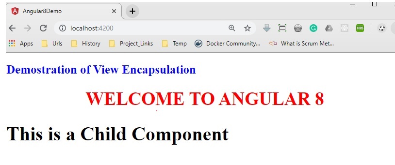
So, as per the output, it is clear that since we have used the styles in the root component, it will apply the styles against the <h1> tag. It is not applied in the child component because we didn’t use the style in that component. Now, in the root component, we just enabled the view encapsulation mode as below.
- import { Component } from '@angular/core';
- import { ViewEncapsulation } from '@angular/core';
- @Component({
- selector: 'app-root',
- templateUrl: './app.component.html',
- styleUrls : ['./custom.css'],
- encapsulation:ViewEncapsulation.None
- })
- export class AppComponent {
- private message: string = 'Welcome to Angular 8';
- constructor() {
- }
- }

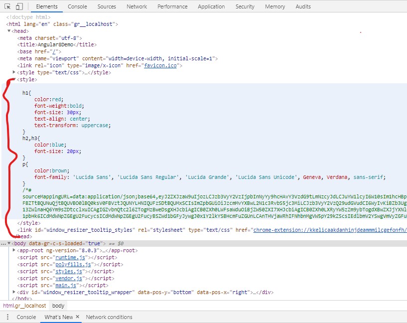
Now, in the above output, the Same style has also been applied in the child component due to the view encapsulation. Now if we inspect the HTML element in the browser, then we will identify that the style-related code has been placed in the header section of the HTML file and that’s why it is applied to both parent & child components.
Demo 2: ViewEncapsulation. ShadowDOM
Now, in this demo, we will check how to use View Encapsulation with Shadow DOM options. For this purpose, make the below changes in the app-root component.
- import { Component } from '@angular/core';
- import { ViewEncapsulation } from '@angular/core';
- @Component({
- selector: 'app-root',
- templateUrl: './app.component.html',
- styleUrls : ['./custom.css'],
- encapsulation:ViewEncapsulation.ShadowDom
- })
- export class AppComponent {
- private message: string = 'Welcome to Angular 8';
- constructor() {
- }
- }
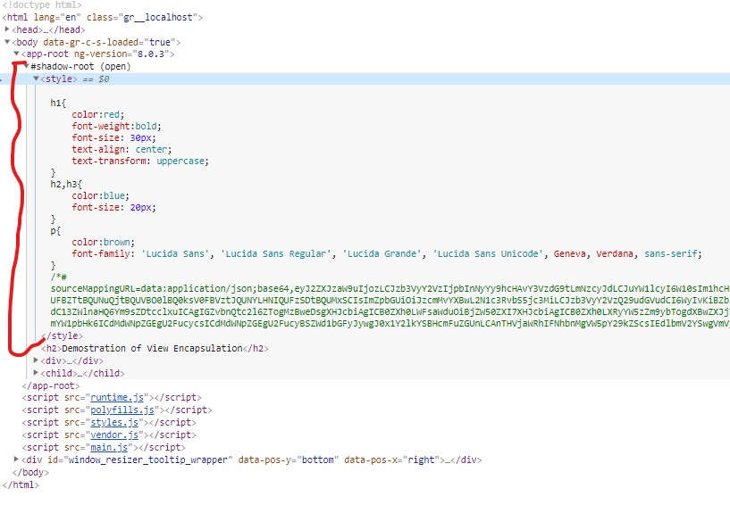
Now check the browser for the output which is the same as previous. But if you inspect the HTML element in the browser, you can see that style-related code has been scoped within the component selector.
Demo 3: ViewEncapsulation.Emulated
Now, for checking the effects of the view encapsulation Emulated types, just make the below changes in the app-root component. As discussed earlier, this type of view encapsulation does not create any shadow dom within the browser.
- import { Component } from '@angular/core';
- import { ViewEncapsulation } from '@angular/core';
- @Component({
- selector: 'app-root',
- templateUrl: './app.component.html',
- styleUrls : ['./custom.css'],
- encapsulation:ViewEncapsulation.Emulated
- })
- export class AppComponent {
- private message: string = 'Welcome to Angular 8';
- constructor() {
- }
- }
Now check the output in the browser.

Demo 4: ng-content
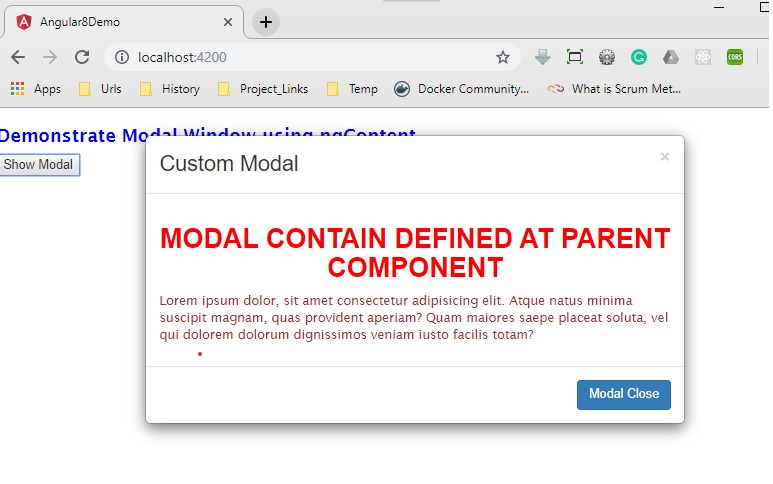
Now in this demo, we will discuss how to use ng-content in our application. For this purpose, here we first develop a component called modal-window to define a popup modal and then implement that component in our app-root component. The content of the modal-window will be defined from the HTML template of the app-root component.
modal.component.ts
- import { Component, OnInit, ViewChild, Input } from '@angular/core';
- @Component({
- selector: 'modal-window',
- templateUrl: 'modal.component.html'
- })
- export class ModalComponent implements OnInit {
- @Input() private display: string = 'none';
- @Input('header-caption') private header: string = 'Modal';
- constructor() {
- }
- ngOnInit(): void {
- }
- private fnClose(): void {
- this.display = 'none';
- }
- showModal(): void {
- this.display = 'block';
- }
- close(): void {
- this.fnClose();
- }
- setModalTitle(args: string): void {
- this.header = args;
- }
- }
modal.component.html
- <div class="modal" id="myModal" tabindex="-1" role="dialog" aria-labelledby="exampleModalLabel" aria-hidden="true" [ngStyle]="{'display' : display }">
- <div class="modal-dialog">
- <div class="modal-content animated bounceInRight">
- <div class="modal-header">
- <button type="button" class="close" (click)="fnClose()">×</button>
- <h3 class="modal-title">{{header}}</h3>
- </div>
- <div class="modal-body">
- <ng-content select="content-body"></ng-content>
- </div>
- <div class="modal-footer">
- <ng-content select="content-footer"></ng-content>
- </div>
- </div>
- </div>
- </div>
app.module.ts
- import { BrowserModule } from '@angular/platform-browser';
- import { NgModule, NO_ERRORS_SCHEMA } from '@angular/core';
- import { FormsModule } from '@angular/forms';
- import { AppComponent } from './app.component';
- import { ModalComponent } from './modal.component';
- @NgModule({
- declarations: [
- AppComponent,ModalComponent
- ],
- imports: [
- BrowserModule, FormsModule
- ],
- providers: [],
- bootstrap: [AppComponent],
- schemas: [NO_ERRORS_SCHEMA]
- })
- export class AppModule { }
app.component.ts
- import { Component, OnInit, ViewChild } from '@angular/core';
- import { ModalComponent } from './modal.component';
- @Component({
- selector: 'app-root',
- templateUrl: './app.component.html',
- styleUrls : ['./custom.css']
- })
- export class AppComponent implements OnInit {
- private caption: string = 'Custom Modal';
- @ViewChild('modal',{static:true}) private _ctrlModal: ModalComponent;
- constructor() {
- }
- ngOnInit(): void {
- }
- private fnOpenModal(): void {
- this._ctrlModal.showModal();
- }
- private fnHideModal(): void {
- this._ctrlModal.close();
- }
- }
app.component.html
- <div>
- <h2>Demonstrate Modal Window using ngContent</h2>
- <input type="button" value="Show Modal" class="btn-group" (click)="fnOpenModal()" />
- <br />
- <modal-window [header-caption]="caption" #modal>
- <content-body>
- <h1>Modal Contain Defined at Parent Component</h1>
- <p>
- Lorem ipsum dolor, sit amet consectetur adipisicing elit. Atque natus minima suscipit magnam, quas provident aperiam? Quam maiores saepe placeat soluta, vel qui dolorem dolorum dignissimos veniam iusto facilis totam?
- </p>
- </content-body>
- <content-footer>
- <input type="button" class="btn-default active" class="btn btn-primary" value="Modal Close" (click)="fnHideModal();" />
- </content-footer>
- </modal-window>
- </div>
For display the modal window, we use the bootstrap CSS in our index.html page as below –
- <!doctype html>
- <html lang="en">
- <head>
- <meta charset="utf-8">
- <title>Angular8Demo</title>
- <base href="/">
- <meta name="viewport" content="width=device-width, initial-scale=1">
- <link rel="icon" type="image/x-icon" href="favicon.ico">
- <link href="assets/bootstrap.min.css" rel="stylesheet" type="text/css"
- </head>
- <body>
- <app-root></app-root>
- </body>
- </html>
Now check the output in the browser.
Conclusion
In this article, we discussed another important feature of Angular Framework i.e. Content Projection. Also, we discussed the different types of Encapsulation features. Now, in the next article, we will discuss how to forms in Angular.

